Brisbane, are we in the midst of an identity crisis?
Yes, we’re the sporting capital of Australia – despite opposition from many in our comment sections on social media – and we’ll host the Olympics in eight short years. But what is our actual brand identity? XXXX Beer? The Broncos? Bin chickens?
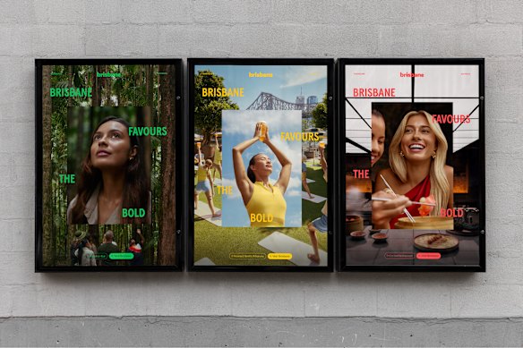
Brisbane’s new identity? US-based brand designer Caleb Nugent has unveiled his vision for Brisbane, at the request of the city’s tourism body.Credit: Calebnugentdesign
A conversation around this was sparked online after a US-based brand designer attempted to give us an answer – at the request of the @Brisbane Instagram account (not the city’s official tourism account).
With slogans like “Ain’t no party like a Brisbane party” and “Give me Brisbane any day”, Caleb Nugent, co-founder of BrandFoundry Collective, tried to encapsulate Brisbane’s aura.
There was a logo that’s based on the shape of our iconic brown-snake river, vibrant green brand colours and modern typeface.
Lord Mayor Adrian Schrinner said the design was “the latest in a stream of creative ideas” flowing in from people “keen to help pitch Brisbane to the world”.
“I love seeing people getting excited about the huge opportunity Brisbane now has to build a big global profile,” he said.
“It’s a reminder the 2032 Games will take us to the next level in a way that would never happen otherwise.”
As a social media editor who is (almost) chronically online, I liked Nugent’s general concept.
So too did the Brisbane team – so much so that they appeared to have set up a meeting with the designer to “discuss next steps”, according to a comment left on the original post.
I had similar discussions about Brisbane’s potential next steps with local brand designers – including the team who had a hand in designing the current Brisbane tourism branding – to see what they thought our city’s rebrand should look like (and if it needed one at all).
Brisbane is ‘hard to capture in one icon’
For Brisbane graphic designer and illustrator Katrina Potter of Little Black Kat, tying the river into the design was “a great concept”, but designing for a city you didn’t live in was “tricky”.
“The biggest trap is designing something that feels like it could belong to any Australian city,” she said.

Brisbane-based brand designer Louise CrozierCredit: Louise Crozier
Brisbane-based brand designer Louise Crozier, who has 15 years of graphic design experience under her belt, agreed the river reference was on the right track.
“[Nugent] intuitively picked up on something locals already feel – the river being the heartbeat of our city. It’s how Brisbane is lived and experienced,” she said.
For Dave Byrne, creative director at Bigfish Design, the team behind the existing tourism branding, Brisbane had always been a city “that’s hard to capture in one icon or element”. That’s why, he said, “the [current] brand is built around a feeling rather than a symbol”.
“It’s something you sense when you live here or visit: a blend of nostalgia and new energy, calmness and excitement – but above all, a genuine love for the city and its people.”
The existing brand, launched in 2022 and created alongside local agencies VML and Bigfish Design, used a colour palette that pulled from the Brisbane environment: jacarandas, sunsets, greenery, sports-inspired maroon and the reflection of the sky on glass.
Brisbane’s tourism campaigns displayed internationally.Credit: Bigfish Design
Don’t recognise these creatives? That’s not surprising because these campaigns were designed to attract tourists to Brisbane.
“Locals may not see the brand as often, and that’s by design - our campaigns target people outside of Brisbane and inspire them to visit, stay and spend,” a Brisbane Economic Development Agency spokesperson said.
“As Brisbane’s Regional Tourism Organisation, our job is to tell that story to Australia and the world.”
An Olympic-sized rebrand?
So, did our city need a rebrand ahead of the Olympics?
Crozier believed the question wasn’t “should” Brisbane undergo a rebrand, but “why” did it need to be rebranded? Before any design was finalised, she believed the purpose of the brand needed to be defined – who are we outside our civic brand and tourism brand?
“Tourism brands are built for visitors, not residents, so it makes sense that locals may not feel represented by it. It isn’t wrong, it’s just doing a different job,” she said.
“What people are reacting to now is the gap in the middle, the absence of a brand that feels like it speaks for the people who live here.”
Potter believed a pre-Olympic rebrand would be a “brilliant” move, provided it was done thoughtfully.
“It’s an incredible opportunity to show the world what Brisbane has become. But rushing it just to meet the Games’ timeline could backfire,” she said.
She suggested the deciding figures engage local creatives and communities to ensure any potential rebrand “feels authentic and timeless, not just an ‘Olympics edition’ of Brisbane”.
Crozier agreed, telling this masthead the city needed to articulate its identity before the Olympic brand arrived, to avoid it being “visually and symbolically swallowed by the Games”.
“The brand needs to exist before the spotlight, so the Olympics amplify Brisbane’s story rather than replace it … And most importantly, a city brand can’t be rushed, it needs research, listening and a clear strategic role to create something with impact,” she said.
Start the day with a summary of the day’s most important and interesting stories, analysis and insights. Sign up for our Morning Edition newsletter.
Most Viewed in National
Loading