
The Devil Wears Prada 2 is as much a fashion show as it is a movie. Chanel, Dior, Balenciaga – it’s a veritable feast for the eyes, with each scene trying to top the last look. What a shame we can barely see any of them.
In comparison to the 2006 film – which had everyone frothing over cerulean jumpers and bright-green overcoats, the sequel is a sea of darker, muted tones. Prada has never looked so washed out. Even when characters wear vibrant ensembles – like Meryl Streep’s red Balenciaga gown – the colours appear more subdued than striking.
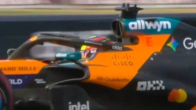
It’s not just the devil’s Prada. A “blue-grey” aesthetic has recently taken over our screens, washing out colours in major blockbusters and television. Some said F1 looked clinical, almost as if it were an advertisement for Apple TV. Meanwhile, both Wicked films were criticised for looking flat and homogenous, especially in comparison to the vibrant Technicolor in The Wizard of Oz.
It’s no better on the small screen. Marvel shows like Daredevil: Born Again have us playing with our televisions’ brightness settings, and the trailer for HBO’s upcoming Harry Potter series has fans worried the remake will lack the colourful magic of the original films (will the Halloween feasts look delicious or dull?).
This isn’t a coincidence. Simeon Bryan, the discipline lead in cinematography at the Australian Film Television and Radio School, says it’s known as “Netflix lighting” – a phenomenon where large, soft lights are used to minimise shadows and make actors appear youthful and “blemish-free”. It also happens to make everything look slightly washed out.
There are technological and aesthetic factors at play.
These days, digital cinema cameras can capture a wider variety of black tones and subtle gradients in dark areas. It’s the reason why so many scenes in Game of Thrones were set at nighttime – the creators were determined to experiment with the rich black tones available to them. These dark tones must then be restored during the colour-grading process.
“In the past, especially when shooting on film, the limits of the system created a more fixed set of outputs. What was defined as a good-looking image was way more standardised,” Bryan says. “Now, with this extended set of exposure values, cinematographers ... have a much greater stylistic range ... Each project seeks to be different, and this is leading to a profound change in the look of things.”
Most productions are now colour-graded for “high dynamic range” displays, Bryan says, mainly because this is considered the highest quality. Less focus is therefore applied to the “standard dynamic range”, which includes Dolby Vision – a system that adjusts the picture to look right on whatever device you’re using.
“Many people don’t have Dolby Vision, so the grade they see might be imprecise to the creators’ intention and look more flat,” Bryan says.
Colour-correcting isn’t the complex, laborious process it once was either. Swinburne’s film and television expert Associate Professor Liam Burke says consistency between scenes can now be achieved with a push of a button, which saves time and money. However, such consistency can also lead to an overall flatness.
Of course, context matters. A show like DTF St. Louis, which explores middle-age masculinity in depressing suburbia, suits a grim aesthetic. A film about luxury fashion, on the other hand, doesn’t.
And yet, muted colour palettes abound. Burke says this aesthetic has become synonymous with prestige and quality – almost like the “HBO-ification” of all entertainment. This is particularly the case for fantastical recent productions like Wicked, Snow White and House of the Dragon.
“For productions to seem realistic or grounded, there’s the idea you have to dull down the colours,” he says. “It signals to an audience that it isn’t a 24-episode broadcast show from a different era. It’s a more grown-up, luxurious, prestige take on these types of characters. It’s changing sentiment and sensibilities.”
The Avengers franchise is a particularly stark example of this. In 2012, Iron Man wore a striking red-and-yellow costume. By the time Endgame landed in 2019, he blended into a soup of greys and blues.
This may not necessarily be a bad thing. Adam Geczy, an associate professor at the Sydney College of the Arts, says it could be a way of re-emphasising character over “look”.
“There’s anxiety over AI, and this need to revive the writer – to look at character rather than design,” he says. “It’s a sort of de-visualisation after the pandemic and writers’ strikes, which really crippled Hollywood. They’re moving back to the primacy of dialogue.”
If that’s the case, perhaps the bland colours of The Devil Wears Prada 2 aren’t a total faux pas. We may not have been able to properly appreciate Miranda Priestly’s ensembles, but perhaps that’s why her biting one-liners were impossible to miss. As she would say, that’s all.
Exceptions to the rule
It’s not all doom and gloom out there. Associate Professor Liam Burke notes two exceptions to the “Netflix lighting” rule: video game film adaptations and DC movies.
Video game adaptations: Films like The Minecraft Movie and the upcoming Street Fighter have more “garish ’80s colour pops” as they attempt to remain faithful to the games’ original look.
DC: The rebooted DC universe, including Superman and Supergirl, appear super-vibrant compared with Zack Snyder’s films a decade ago. Burke says this is a way to distinguish its new universe from its predecessors and from Marvel, as well as signalling a return of optimism after years of not-so-successful grit.
Must-see movies, interviews and all the latest from the world of film delivered to your inbox. Sign up for our Screening Room newsletter.
Nell Geraets is a Culture reporter at The Age and The Sydney Morning Herald.Connect via X or email.