Opinion
October 28, 2025 — 7.00pm
October 28, 2025 — 7.00pm
On Wednesday, October 22, the Bureau of Meteorology launched its first major website redesign in 12 years. By the next morning, the organisation had turned off comments on its Facebook page – meteorologists and everyday Australians were united in their fury.
The timing was exquisitely bad. As the BOM unveiled its “modern and sleek” redesign, costing millions of dollars, savage storms were bearing down on Australia’s south-east. Fishermen at sea couldn’t find wind speeds, and farmers were unable to locate rainfall data.
Even one of the BOM’s own meteorologists admitted on ABC Radio that he didn’t like the new site and was still using the old one.

Dr Stuart Minchin started as the Bureau of Meteorology’s chief executive on October 3.Credit: Bureau of Meteorology
Who, in their right mind, pushes a complete, untested-in-the-wild overhaul of a national weather service at the start of the Australian storm and bushfire season?
This is, of course, the same organisation that spent $70,000 in 2022 on consultants to tell us to stop calling it “BOM” and use “The Bureau” – a rebrand that was laughed out of the room.
Three years later, the launch of this website has been, to quote a BOM staffer, an “absolute shitshow”.
The $4.1 million question
It shouldn’t have been this way. The bureau claims it spent $4.1 million on the redesign as part of a broader $866 million, seven-year technology transformation dubbed “Robust”. They ran a beta site for more than 15 months, testing for far longer than standard practice. They say they conducted “extensive user research and testing” and consulted the community. They received – they assert – “overwhelmingly positive feedback”.
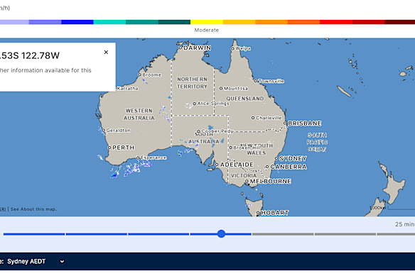
The new rain radar on the BoM website.Credit: Bureau of Meteorology
The BOM did the work, or at least claims to have. So how did 2.6 billion annual page views’ worth of users immediately reject the new version?
It speaks to a staggering disconnect between one Australia’s most critical pieces of public infrastructure and its users.
Critically, the new BOM site fails in the one area it absolutely had to get right: the radar. For millions of Australians, this is a vital tool. Farmers use it to plan harvests, fishermen use it to stay alive, and the rest of us use it to decide if we need to bring an umbrella or if we can safely hang out the washing.
Either the BOM was testing with a completely unrepresentative sample, or they simply weren’t listening to the feedback.
Let’s examine that beta testing. For 15 months, the site sat at beta.bom.gov.au alongside the main site. There’s a problem: most people didn’t know it existed, and those who did could simply ignore it and use the reliable old site instead. This wasn’t real-world testing, it was a voluntary opt-in for tech-savvy early adopters.
Real-user testing for a site this critical would have involved forced migrations of user groups, A/B testing of core features, and extensive observation of how people actually use weather data under pressure. That’s not during a leisurely stroll through sunny Bondi but instead when a heavy storm is rolling in and you need to know right now whether you need to secure your boat.
The BOM claims the radar colours are improved, but users overwhelmingly disagree. Meteorologist Tony Auden pointed out that the new colour scheme – which tops out at orange instead of the old black – made Brisbane’s severe storms look less threatening than they actually were. In weather forecasting, that’s not just poor user design. It’s dangerous.
The Caboolture problem
Caboolture was erased from the map.Credit: Catherine Strohfeldt
Caboolture, a rapidly growing city north of Brisbane, presents a perfect microcosm of the failure: it has simply disappeared from the new site’s locators. Meanwhile, the default map shows the entire Australasian region, including Papua New Guinea and Samoa.
This reveals a fundamental misunderstanding of users. Most people checking the weather aren’t planning a tour of the Pacific. They want to know if it’s going to rain in their suburb in the next two hours.
The BOM’s response to the firestorm has been telling. They expect “a dip in customer satisfaction” as people “familiarise themselves” with the changes. They say it’s “just the beginning of our journey” and they’ll make improvements based on feedback. They point to the 2020 app redesign, which faced similar criticism. But for BOM to say “it’s not us, it’s you” is digital gaslighting.
Loading
It’s common for people to not like change; criticism routinely follows any major app or website redesign. But this isn’t acceptable for critical infrastructure. The BOM’s website isn’t a social media platform experimenting with features. It’s how millions of Australians make life-and-death decisions about severe weather. The “move fast and iterate” philosophy of Silicon Valley has no place here.
The old site wasn’t pretty, sure, but it was functional. It had 72,000 pages because it needed to serve every Australian in every environment.
The weather waits for no one
It’s 2025 and we deserve better. User experience design is not some kind of dark art. We have decades of research, best practices and tools for understanding how people interact with websites. We have heat-mapping, session recording, user testing platforms and accessibility checkers. The BOM had $4.1 million and 15 months.
The Australian public isn’t being unreasonable when they expect a critical government service to work properly. It’s OK to demand that the websites we use every day – especially ones we fund with taxpayer dollars – actually serve our needs. And we deserve to be frustrated when consultation processes apparently ignore the people they’re meant to serve.
The weather waits for no one, and neither should good design. The BOM needs to stop defending a failed launch and start on the fix.
* The old BOM site remains active here.
David Swan is the technology editor for The Age and The Sydney Morning Herald.
The Opinion newsletter is a weekly wrap of views that will challenge, champion and inform your own. Sign up here.
Most Viewed in Technology
Loading