The NRL premiership-winning Brisbane Broncos have officially launched their new look for the 2026 season, after inadvertently leaking the logo in June.
More than five months after this masthead exclusively revealed the new look, the Broncos released the branding early on Wednesday morning.
It was meant to be a closely guarded secret, but a premature application to protect the logo through IP Australia led to its discovery by this masthead.
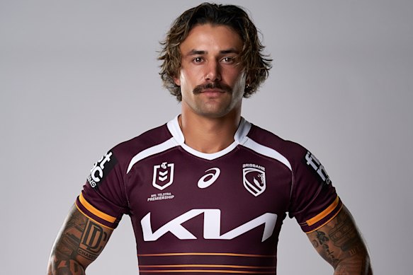
Jesse Arthars models the new Brisbane Broncos jersey for season 2026.Credit: Brisbane Broncos
Notably missing from the new club badge was the word “Broncos” – maintaining a trend that has seen the likes of the Dolphins, South Sydney, Canterbury-Bankstown and Penrith let imagery, rather than words, do the talking.
AFL clubs Adelaide, Collingwood, Melbourne, Sydney and North Melbourne have taken a similar approach in recent rebrandings.
The Red Hill-based club described its new logo as “the iconic Bronco, forward-facing, at its heart, a shield nodding to the original 1988 logo, and the Brisbane River flowing through the mark” – which echoed University of Queensland sports branding expert Sheranne Fairley’s interpretation in this masthead in June.
Global brand agency DDB Group, which was also responsible for the contentious rebranding of Italian giants Juventus, spent 18 months consulting with players, staff, member groups and sponsors to develop the logo.
Broncos chief executive Dave Donaghy said the new look was more than just a logo.
“It’s a statement of who we are, where we’re from and importantly, where we’re headed,” he said.
“It honours our past, celebrates our city, and positions us for the next generation, making us recognisable globally as we move towards Brisbane 2032 and as the NRL expands overseas.
“We’d be doing the club, our members and fans a disservice if we didn’t prepare for the broader opportunities in front of us.
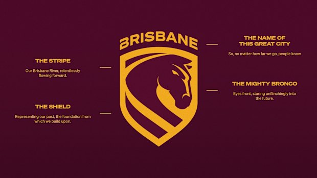
The new Brisbane Broncos logo explained.Credit: Brisbane Broncos
“And what a way for our old logo to bow out, having been part of some of the club’s greatest moments, including the history that was made this year.”
NRL head coach Michael Maguire said the new logo was about “building on the history”.
“There’s a lot of meaning to the new logo when you dig a little deeper, there’s a great storyline that is told,” he said.
Loading
“You can’t stand still. You’ve got to keep moving forward, and we have an exciting group.
“I feel we’re at the infancy of what we can go towards but it’s going to take everyone to be able to do that and charging on is a big part of it.”
Both the men’s and women’s teams were crowned premiers of their respective competitions in 2025, in a stellar year for Brisbane’s winter codes that also saw the Brisbane Lions take out the AFL premiership.
The Lions’ women’s team will face North Melbourne this weekend for the AFLW premiership cup to attempt a Brisbane clean sweep.
Start the day with a summary of the day’s most important and interesting stories, analysis and insights. Sign up for our Morning Edition newsletter.
Most Viewed in National
Loading